


How Microsoft’s Fluent Design Shaped the Future of UI: Motion, Layers, and Human-Like Interactions
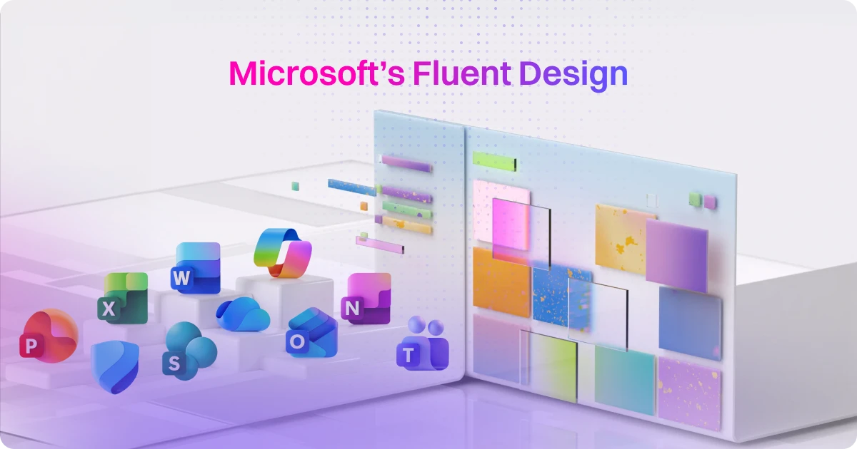
table of content
At Motion The Agency, animation is only part of the story. We also spend a lot of time designing modern, engaging UI that improves how products actually feel to use.
Over the years, we’ve helped clients bring their interfaces to life with motion, micro-interactions, and thoughtful UI systems.
Projects like Tasknet, OpenMoney, and SealIt are good examples. In those projects, animation was not decoration. It helped guide users, clarify features, and make complex products easier to understand.
But the way we design interfaces today is very different from how the tech industry approached UI ten years ago.
We now live in what many designers call the Era of Scroll. People decide within seconds whether a product deserves their attention. If an interface feels slow, static, or outdated, users move on immediately.
That shift has changed how companies think about design. It is no longer just about looking clean or minimal. It is about creating interfaces that respond, move, and communicate clearly.
One of the companies that pushed this shift forward in a big way was Microsoft.
Tech design in the early 2010s: The great flattening
.png)
o understand Microsoft’s current design language, it helps to look at the early 2010s.
During that time, the tech industry went through what many designers now call the great flattening. Interfaces moved away from skeuomorphic styles toward flat, minimal design.
.png)
Microsoft’s Metro design language played a major role in that shift.
Metro focused on typography, simple shapes, and clean layouts. Visual textures and shadows were removed. Interfaces became extremely flat and structured. The goal was clarity and efficiency.
Not long after, other companies adopted similar approaches. Apple’s iOS 7 introduced a comparable flat aesthetic in 2013, and soon many digital products began to look almost identical.
Flat design solved some usability problems, but it created another one. Interfaces became clean but emotionally distant. Products were easy to use, yet many of them felt sterile and indistinguishable from each other.
Something was missing.
Microsoft switches to Fluent design style
Fluent design
.png)
While doing our research, we realized that Microsoft wasn’t the first tech company to use this design style. Apple’s iOS 7, released in 2013, incorporated similar elements to the Fluent Design style, but it remained mostly flat. The key difference with Microsoft’s Fluent Design is how it transitioned from a flat, minimal aesthetic to a much more immersive design with more layers, softness, and a focus on human-like interactions. The use of new materials like Acrylic and Mica gave the interface depth, making it feel more alive and interactive.
Microsoft fully embraced this immersive design style in Windows 11, released in 2021. This was a dramatic departure from the Metro design they had used before, which focused heavily on flat, functional, and efficient interfaces. Fluent Design, on the other hand, emphasizes layered depth, softness, and human-like interactions, making the interface feel more approachable and alive. It’s a shift that not only redefined their UI but also set the tone for the broader design trends we see today.
User feedback from Microsoft
One reason Fluent Design resonated with users is Microsoft’s heavy focus on user research during development.
Instead of designing purely from internal assumptions, the team continuously tested concepts with real users. They studied how people reacted to visual changes, motion, and interface behavior.
One question that surfaced during testing was surprisingly simple:
“Does this product look like it has more AI in it?”
The goal was not to show off technology. It was to make the interface feel smarter and more intuitive.
That mindset shaped many of Fluent’s design decisions. Motion, lighting, and layered elements were used to make the interface feel approachable and responsive, not overly technical.
Fluent design as a flex for Windows 11
One big reason for Microsoft’s design shift with Windows 11 was the need to fully take advantage of modern hardware. With Fluent Design, Microsoft introduced features like glass effects, blur, and 3D elements—all of which require powerful GPU and CPU to render properly. This allowed them to create an immersive experience that felt more dynamic and alive, something that flat designs just couldn’t deliver.
.png)
It was also a bit of a hardware flex. Windows 11 showed off what modern devices could really do. As hardware got stronger, Microsoft’s design evolved to match. At Motion The Agency, we do something similar. For clients like OpenMoney, we create designs that take full advantage of cutting-edge hardware, offering immersive experiences that feel future-proof. Just like Microsoft, we make sure our projects are high-performance and optimized for the latest tech trends, so the user experience keeps improving.
Industry influence and our projects
The ripple effect: do other brands follow them
Microsoft’s shift with Fluent Design had a profound impact on the entire tech industry. Following Microsoft’s lead, major players like Apple, Samsung, and Airbnb adopted glassmorphism and 3D elements in their user interfaces. These additions introduced a new layer of immersive design, making their UIs feel more tactile, engaging, and dynamic, while offering users a more premium experience.
However, not every company followed the same design trend. Google, for instance, chose to stick with its core flat design principles but introduced fluid animations with Material Design 3. This allowed Google to maintain a minimalist aesthetic while still creating a dynamic user experience. The focus was on motion rather than depth, adding interactivity and life without relying on 3D elements or heavy visual effects.
How does this affects our clients
At Motion The Agency, we use motion to make digital products feel responsive, human, and alive. For example, with OpenMoney’s hero UI animations, we brought their complex financial features to life in a clear and engaging way. We believe design should go beyond functionality; it should connect with users and create an experience that feels intuitive and personal. We help brands move from flat designs to immersive experiences, ensuring users not only interact with the product but truly connect with it.
Our role is to bring this philosophy to life in our designs. We focus on creating dynamic, immersive interfaces that engage users and build a deeper connection with the product. This shift allows brands to move beyond static designs, creating interfaces that are not only functional but also enjoyable and relatable, leading to more meaningful interactions and stronger user engagement.
We’ve worked with brands like Firmus AI, Langease, and CJM, helping them embrace this layered, immersive design approach. By balancing motion and design principles, we ensure that our clients’ interfaces are visually compelling, easy to navigate, and high-performing, offering an experience that feels both intuitive and alive.
The common thread: Motion
Motion is the vital thread that ties together modern UI designs. Whether through light, layers, or fluid animation, motion has become the key element that defines the user experience today. It transforms static interfaces into dynamic, engaging environments that feel responsive and alive, making the digital experience more intuitive and human.
Microsoft’s shift to Fluent Design is a prime example of this evolution. Their transition from flat, minimal design to a more immersive, layered interface highlighted that design isn’t just about clean aesthetics. It’s about making the experience feel more human by incorporating motion, depth, and the third dimension. This approach allows users to connect with the product on a deeper level, blending technology with a natural, human touch.
What other companies can steal from Microsoft’s Fluent Design
Microsoft’s Fluent Design is not just about aesthetics. It shows how modern interfaces can feel more responsive, more intuitive, and easier to understand.
The good news is that most of these ideas are not exclusive to Microsoft. Product teams can apply many of the same principles in their own products.
Here’s a simple step-by-step checklist teams can use when improving their UI.
Final thoughts
Flat design helped simplify digital products during an important stage of the web’s evolution. But today’s interfaces demand something more.
Users expect products to feel responsive, intuitive, and alive.
Microsoft’s Fluent Design shows how layering, motion, and subtle visual depth can transform the way people experience software.
At Motion The Agency, we apply these same principles when designing interfaces and motion systems for our clients. When motion is used intentionally, it helps products communicate more clearly and feel easier to use.
The brands that stand out in the next wave of digital products will not rely on static layouts alone. They will treat motion as part of the design system itself.
And that is where modern UI is heading.
If you have a design ideas in mind, or want to translate what microsoft did to a video, feel free to book a call with us

Wira Wibisana
As a Design & Marketing Specialist at Motion The Agency, Wira loves sharing knowledge, trends and crafting content that helps brands grow through video and design.


Syarafina Kuswahyuni
Syarafina Kuswahyuni is a content marketer at Motion The Agency, where she covers explainer video production, motion design trends, and video marketing strategy for SaaS brands. She has worked alongside Motion's animation team on projects for clients including ClickUp, Apollo.io, and HackerRank
In just a few questions, get a tailored estimate for your next video project.


Contact Us
Ready to elevate your brand? Contact us for your
Free Custom Video Sample


