TaskNet rebrand: new identity, new web design & 3D UI animation
In early 2025, TaskNet reached out after trying several agencies for their rebrand, website, and explainer video. The problem? No one could handle the full process end-to-end, the animations didn’t match their vision, the website lacked impact, and everything felt disconnected. So they booked a call with us and that’s where the real transformation began.

Project type
Subscription


Project timeline
5 months


What they want
Strong branding and visual consistency across all platforms
When TaskNet came to us, they had a logo, a very minimal site, and a complex product that needed simplifying. We kicked things off by building a proper brand guideline and a few key marketing assets. From there, we redesigned their website to better reflect their brand and used UI animations to make the product easier to understand. To bring everything together, we created an explainer video that clearly shows what the product does and why it matters.

Brand identity
What began as a simple logo tweak became a full rebrand. We helped TaskNet define their visual style, create brand guidelines, and other marketing collateral they needed

Website revamp
TaskNet had a site, but it didn’t match their new brand or tell their story well. After the rebrand, we gave it a full refresh and added custom animations to make their product easier (and more engaging) to understand.

Explainer video
Just like the animations we built for their website, TaskNet needed a way to explain their brand in a way that actually connects. Something simple, clear, and easy to find, even for people who might not realize they’re the ones TaskNet is built for.
The reason why they find us
Why Motion The Agency?
TaskNet had different agencies for branding, web, and animation, but nothing felt connected. The designs didn’t match, lacked consistency, and things kept slipping through the cracks. They needed one team that could handle it all, move fast, and get what they were building. In-house wasn’t an option, so they came to us. One team. One subscription. Everything covered.


Before


After
Industries We Serve
The challenges

Big project, we couldn’t start everything at once
Since TaskNet came to us without a solid branding, we couldn’t jump into everything at once. Even with enough credits, we had to tackle things one at a time to make sure every piece felt consistent and aligned.
No clear brand identity or unified direction
TaskNet had worked with multiple agencies, but everything felt disjointed. There was no strong brand identity to build from, so we had to start fresh and unify everything from the ground up.

Tight coordination across multiple deliverables
We weren’t just doing one task. This was a full rollout: web pages, UI animation, brand assets, and eventually a full explainer video. Keeping everything aligned, visually and strategically, was key.

Custom animation style with limitations
TaskNet wanted a 2.5D isometric style that couldn’t be handled with our usual Lottie (JSON) format. We had to pivot to MP4 to preserve the style while still ensuring smooth performance.

Explaining a complex product in a simple way
TaskNet needed an explainer video early on to help build trust and simplify their message. Their product was technical, so we had to first create a clear visual language before turning complex ideas into something their audience could easily understand.

We always start with a quick kickoff call to align on goals and priorities. From there, we plug clients into our creative workflow using tools they already know, no new platforms to learn.
The client get a dedicated Slack channel for real-time updates, a shared dashboard to track requests and revisions, and a clear timeline for each deliverable. Everything’s built to be transparent and easy to follow, whether we’re working on brand design, motion graphics, or full website builds.
Each step is mapped out visually, so your team always knows what’s in progress, what’s up next, and what’s ready for review. No bottlenecks. No surprises. Just a system that keeps things smooth from start to finish.


Result
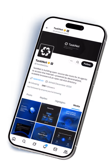
Social media collateral


Result
UI animations
Result
Animation video
Lesson learned
Key takeaways


Branding goes beyond a logo
TaskNet came to us for a simple logo update and some web design support. But without a solid brand identity, nothing felt truly connected. This wasn’t just a design job, it was about building cohesion. We helped them shape a scalable brand system that worked across their site, content, and animations.

Subscription model perfect for scaling up
Startups and growing teams often struggle with re-explaining their brand to every new freelancer. TaskNet didn’t have to. Our subscription model gave them direct access to our team, making it easy to scale creative work without starting from scratch each time.

Adapted to fits their needs
TaskNet knew what they wanted, a clean 2.5D isometric animation style. It didn’t play well with Lottie, so we made the call to switch to MP4. Heavier format, but worth it. The animations stayed sharp, on-brand, and worked exactly how they needed across the site.
Get free sample
Let's build something great together! Get free video or design sample
Contact Us
Ready to animate your vision? Contact us for your
free video or design sample

%20(1).avif)
Thank you!
Your submission has been received.


Oops! Something went wrong while submitting the form.