What Is UI Animation and Why It Makes Your Website Feel Alive
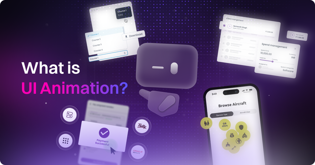
table of content
What is UI Animation
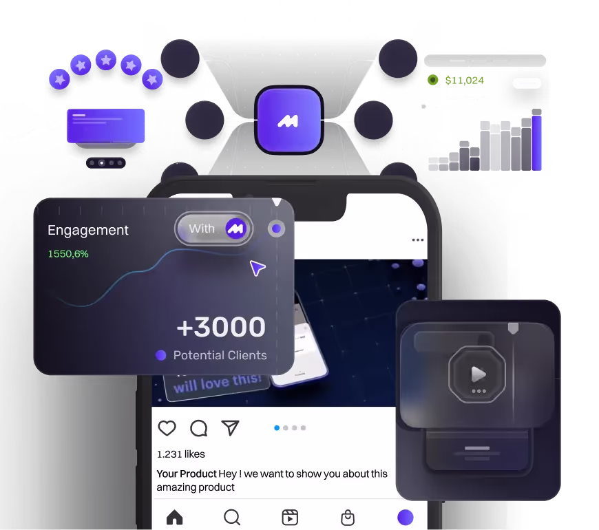
Have you ever visited a website that not only looks good but feels good? You know, when you move from page to page and the transitions are smooth, or when you click something and there’s that little animation that lets you know, “Yep, I got your click!” These are examples of UI animation.
So, what exactly is UI animation?
It’s the subtle movement that happens when buttons animate on click, pages transition smoothly, or feedback is given after an action, like a form submission.
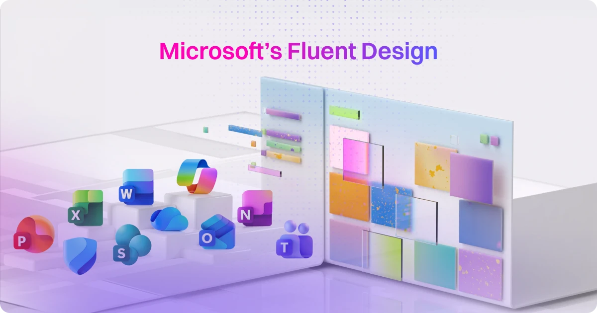
As a motion design agency that also specializes in web design, we understand how powerful these animations can be in creating an engaging and intuitive user experience. Microinteractions, smooth transitions, and feedback animations all work together to make websites and apps feel alive, giving users a sense of connection and fluidity. We actually talk a lot about how UI animation’s principles influence UX in our blog “Principles of UI Animation and Web Design That Make Everything Feel Better”
But why should we care about UI animation? It's no longer just a visual trend; it's becoming a standard practice in digital design. As more people use UI animation to boost engagement and improve the overall user experience, it’s important to understand how these small touches can make a big difference in keeping users engaged and happy on your site.
So, Why UI Animation is Important?
Okay, we get it. It’s easy to argue that UI animation isn’t absolutely crucial for websites. In theory, a website could still function without any animation. But that doesn’t mean it isn’t important. UI animation plays a huge role in improving user engagement and making the interaction feel more dynamic. When done right, it enhances usability, guides users through actions, and adds personality to the product. Here’s how it helps:
UI animation doesn’t just make a site look better; it enhances the user experience by making things feel more natural and intuitive. For instance, when you click a button and it reacts with a subtle animation, it confirms your action, making the interface feel responsive. This clears up any uncertainty and keeps users engaged. Animations like page transitions or microinteractions (think toggles and notifications) help keep the experience alive and interactive, rather than static.
Ever visited a website where everything looks great but still feels clunky? That’s where UI animation can make a difference. It adds smooth transitions and interactive animations that make the whole experience feel more responsive and intuitive. Tools like Lottie and Rive allow you to showcase products dynamically without weighing down the site. These lightweight animations improve clarity, provide real-time visual feedback, and keep users engaged, creating a smoother, more enjoyable experience.
UI animation improves UX by helping users navigate, understand feedback, and enjoy the experience. It also benefits companies, leading to better engagement, lower bounce rates, and even SEO visibility. Users form first impressions in as little as 50 ms, and sometimes as fast as 17 ms. Smart animation makes that split-second count, boosting credibility and reducing friction.
Types of Animations to Showcase in UX Design
We actually discussed this in more detail in our blog, "UI Animation Examples." In this section, we'll briefly mention a few examples that we frequently come across in our research for UI animation content, as well as the ones that often come up in client requests.
Microinteraction
Micro-interactions are small, subtle animations that occur when you perform simple actions on a website or app, like tapping a button, flipping a toggle, or hovering over an icon. Though they happen quickly, these animations play a significant role in enhancing the user experience. Examples include a heart icon that fills up when you like a post, a switch that moves from off to on, or a button that shrinks and pops back when clicked. These are the kinds of animations that many people tend to miss when they’re there, but you’ll definitely notice when they’re not. Apple is a prime example of effective micro-interactions, with their UI animations evolving over time to make every action feel smooth and natural.
These tiny animations matter because they provide instant feedback, letting users know what happened without needing further explanation. The main goal of micro-interactions is to increase the smoothness of the overall experience and give users clear indicators of what happens next after they’ve triggered an action. Without them, interactions feel unresponsive, but with them, products feel more alive and intuitive. Micro-interactions create a smoother, more satisfying experience that users might not consciously notice, but will definitely feel every time they interact with a product.
Feedback and Status Indicator
Have you ever been on a website or app and felt unsure whether your action actually went through? Maybe you clicked something and nothing happened, or you had to wait and had no idea what was going on. That’s where Feedback & Status Indicators come in. They’re those little animations or visual cues that show something is happening behind the scenes, making sure you know the system is working and responding to your actions. Without them, things can feel frozen or unresponsive, leaving users frustrated.
These animations are like micro-interactions but are specifically designed to give feedback. They show you that the system has received your input and is doing its thing. Think of it as a little reassurance that things are working. Apple does a great job with this, like when you get the subtle animation for Apple Pay approval or the quick cue when Face ID kicks in.
These feedback animations don’t just look good; they help users feel in control and confident. They’re especially popular in SaaS apps dealing with big data or finance. For example, you might see an animation showing the percentage of data processed, or a quick animation when a payment is sent or received. It’s all about keeping users informed and in control, even when they’re dealing with complex processes.
Onboarding Animation
.png)
Have you ever used an app and felt lost right at the beginning? Onboarding animations are there to help with that. They guide new users through the app or product without bombarding them with too much information. Instead of throwing everything at you at once, they introduce features step by step in a fun and welcoming way. A great example of this is Airbnb’s latest onboarding animation, which helps users understand new features without feeling overwhelmed. You’ve probably seen animations like tooltips popping up to show you where to click or a little glow around something you need to swipe. The image above is a screenshot of Tinder's onboarding animation when you apply for the first time, guiding you through the key steps.
So why do these animations really matter? First impressions are everything. If your app feels confusing from the start, people will likely leave before they even get the hang of it. Onboarding animations make everything feel less stressful by breaking down the learning process. They guide you, show you what’s important, and make the whole experience feel smoother. Instead of just leaving users to figure things out, onboarding animations make the process feel easy and welcoming.
When done right, onboarding animations create a more engaging and personal experience. It’s like having a guide that shows you around, making the whole thing feel intuitive. And the best part? It leaves a good impression that keeps users sticking around and excited to explore more of what the app has to offer.
Delight Elements
Delight elements are the fun, unexpected touches that add personality and charm to your app or website. They go beyond basic functionality and make the experience more enjoyable. It’s not about making things more efficient, but about creating those little moments that make users smile and feel more connected to the product.
You’ve probably seen these in action, like confetti popping up when you finish a task or a fun animation when you tap something unexpected. These small moments keep the experience from feeling robotic and help keep users engaged. A great example is Duolingo. After every lesson, you get a little celebration animation, whether it’s confetti or your little Duo character cheering you on. The example above is the animation Duolingo has every time users finish their training for the day. It’s simple, but it makes the app feel rewarding and playful, which encourages users to keep coming back.
So why do these animations matter? They help users feel good about interacting with your product. A little fun goes a long way when it comes to boosting engagement, sparking emotions, and making the experience memorable. When done right, these animations add charm without being distracting. They make your product feel more human and alive, showing that you care about the user experience, not just the end result.
What Are The Best Practices For UI Animation?
When you’re adding UI animation to a website, there are a few things to keep in mind to make sure it enhances the user experience instead of hurting it. Bad animation equals bad UX. If the motion feels off, too flashy, or awkward, it can confuse users or make the site feel broken. On the flip side, smooth motion signals professionalism. It shows that the design is polished, clean, and well thought out, making the whole experience feel more seamless and enjoyable.
To get it right, here are a few key performance rules to keep in mind:
- FPS (Frames Per Second): Always aim for 60 FPS to keep animations smooth and fluid. Anything lower, like 30 FPS, can make animations feel choppy or stuttery, which ruins the experience. A solid 60 FPS makes motion feel natural and seamless, especially for page transitions or interactive elements.
- CLS (Cumulative Layout Shift): Avoid layout shifts that break the flow. If your page content moves around unexpectedly while users interact with it, it can feel jarring and disorienting. CLS is all about maintaining stability. You don’t want buttons or text shifting while someone is trying to click or read. A stable layout helps create a smooth, predictable experience.
- FID (First Input Delay): This one is simple. Make sure animations are responsive and fast. FID measures the time between a user’s interaction, like a click, and the page’s response. If there’s a delay, users might think their click didn’t register, which can be frustrating. A low FID makes everything feel snappy and responsive.
- TTI (Time to Interactive): Don’t make users wait too long to interact. TTI measures how long it takes for the page to become fully usable. If users are stuck waiting because of animations or heavy content, it slows them down. Keeping TTI low means users can jump in and start interacting right away.
Timing Tip: For smooth animations, use ease-in/ease-out timing (around 200–500 ms). This makes the animation feel fluid and natural. For bouncier effects, like when something pops or shakes, use elastic or bounce easing with a duration of 800–1200 ms. This makes the interaction feel more playful and fun.
We actually talk about this in a more detailed fashion in our blog “How to Make UI Animations Run Smoot Without Slowing Down Your Website”
So, What Are the Tools Needed for UI Animation?
Diving into UI animation? Love that for you. The right tool can seriously level up your product and make the whole experience feel more alive and intentional. But here’s the thing, there’s no one-size-fits-all. It really depends on what you're building, how interactive it needs to be, and who on your team is handling the motion. So let’s run through some of the tools we actually use and what they’re best at.
After Effects + Bodymovin
.png)
Best for: Polished, high-end animations that need to feel premium and intentional. Perfect for onboarding flows, hero transitions, or branded microinteractions where motion plays a big role in elevating the user experience. These tools give you tons of creative flexibility and control, making it easy to design smooth, cinematic animations. The tradeoff is that they are not always developer friendly. Most of the time, there is no direct code export, so handoff has to be done manually through motion specs, screen recordings, or close collaboration with developers. Still, when you are aiming for that premium look and feel, the extra effort is totally worth it.
Rive
.png)
Best for: Real-time, interactive animations that respond directly to user input. Ideal for buttons, toggles, hover states, and other micro-interactions that need to feel responsive and intuitive. These tools are built for live feedback and motion that feels connected to the user experience. There is a bit of a learning curve at first, but once you get the hang of it, you unlock a ton of creative control and flexibility that is perfect for building playful, engaging interfaces.
Figma Smart Animate + Dev Mode
.png)
Best for: Quick mockups and design handoff. Great for showing transitions, flows, and basic animations right inside your design tool without switching apps. It is super handy for communicating ideas to stakeholders or developers early on. Just keep in mind it is not production-ready. You will still need another tool to build out the real animation or export it for use in a live product.
LottieFiles Editor
.png)
Best for: Lightweight motion and quick animation tweaks. Perfect for polishing button hovers, loading icons, and other small UI details that make a big difference. You will not be building full animations from scratch here, but it is a solid choice for refining and fine-tuning animations you have already created. It is especially useful during the final stages of design, where subtle motion can help add polish without slowing down the workflow. While it is not the most powerful tool, it gets the job done when you need quick, clean results.
Framer Motion / GSAP (React)
.png)
Best for: devs who want total control in code. These libraries are super flexible and perfect for shipping smooth, performance-friendly animations in production. GSAP was recently acquired by Webflow, and now it’s completely free for everyone. No subscription, no gatekeeping — just full access to one of the most powerful motion libraries out there. But yeah, it’s code-based. No timeline UI here.
So, which one should you go for? If you’re just mocking things up, Figma will get you moving fast. If you’re building something more interactive, Rive or After Effects with Bodymovin are solid options. And if you’re shipping in React, Framer Motion or GSAP gives you all the control you need. Just pick the one that fits your workflow, your team, and the kind of motion you want to create.
The Future of UI Animation, Is It AI?
Okay, the truth is we’ve talked about this a few times in our content already. First in our AI Prompt-to-UI breakdown, and then again in the AI in UI Animation blog. But it keeps coming up, so here’s the updated, no-fluff take.
AI in motion design? Yeah, it’s starting to pull its weight, but right now it’s more of a sidekick than the main character. Tools like Galileo and Visily are actually super handy when you just need to get ideas out fast. You can throw in a rough prompt or even a sketch, and boom, you’ve got a UI layout to play with. It’s not perfect, but it’s a great way to unblock yourself or move through those early stages quicker. That said, you’ll still need to clean things up. The output isn’t ready for production, and it definitely doesn’t replace the finesse you get from building things by hand.
We’ve also been testing some AI features that help on the motion side, and honestly, they’ve been solid.
- Auto timing and generative motion tweaks save time on the repetitive bits. Instead of tweaking every keyframe, you get smoother movement right out of the box.
- Stick to 60 fps if you want your animations to feel clean and responsive. Anything less starts to look off real fast.
- Respect prefers-reduced-motion so your work stays accessible for users who need a lower-motion experience.
So yeah, AI can definitely help you move faster and skip the boring stuff. But if you want your motion to actually tell a story and feel right, you still need a real creative in the mix. It’s a tool, not a shortcut.
If you are interested in a more AI tools that could be use for UI animation, feel free to check out our blog “UI Animation Meets AI: What Works, What’s Hype, and What We Actually Use”
Conclusion
Well, you probably came here to get to know and understand UI animation better. The thing is, just like any other subject in the creative industry, "UI animation" can mean a million different things, depending on who you ask.
But in general, UI animation (short for user interface animation) is all about adding motion to elements on the screen to make things feel more interactive, polished, or just straight-up engaging. It could be something super small, like a button bouncing a little when you click it, or something bigger, like a full hero animation that helps explain what the website or product is all about. So, it might not be the most important thing on the website. As we’ve said before, your website can run without it. But UI animation is one of those "it" factors that can really lead to more user engagement.
It’s not just for purely aesthetic purposes either. UI animation also helps with the overall user experience (UX) of the site. From giving direct feedback to the user to helping them understand the hierarchy of the website – where things come from and where they’re going – it helps users adapt and better understand the content of the site. So, if you ask us how important UI animation is, we’d say it’s important enough that we highly encourage you to use it on your website.
Ready to take your website to the next level with killer UI animation?
Check out our web design services and book a call with us to discuss how we can bring your ideas to life. We’re here to help make your site engaging, interactive, and user-friendly!

Syarafina Kuswahyuni
Syarafina Kuswahyuni is a content marketer at Motion The Agency, where she covers explainer video production, motion design trends, and video marketing strategy for SaaS brands. She has worked alongside Motion's animation team on projects for clients including ClickUp, Apollo.io, and HackerRank

In just a few questions, get a tailored estimate for your next video project.

Contact Us
Ready to elevate your brand? Contact us for your
Free Custom Video Sample