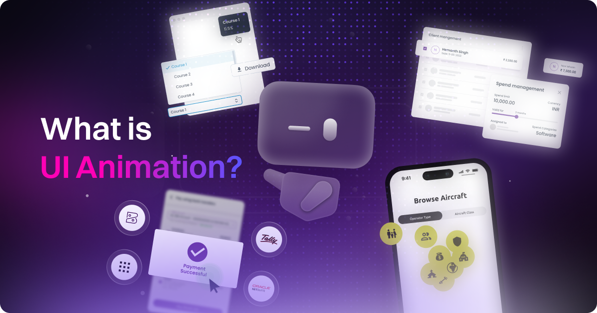
Principles of UI Animation and Web Design That Make Everything Feel Better
.png)
table of content
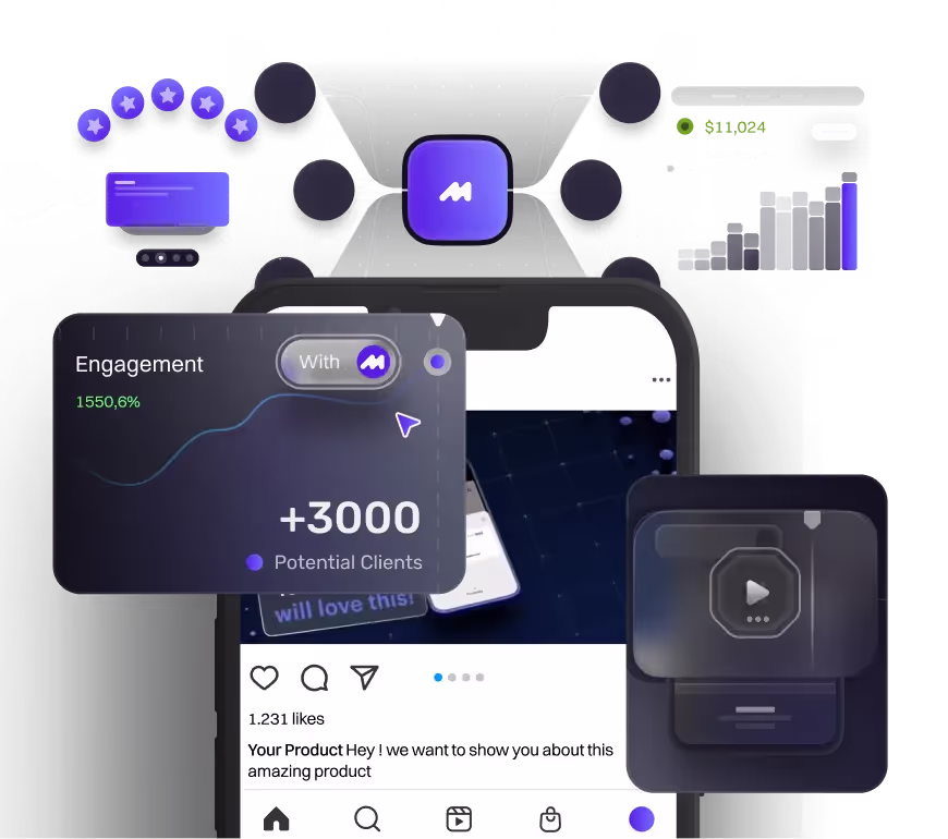
Let’s be honest, the first thing people notice when they click on a website is probably how fast it loads. But right after that, it’s all about how the site looks and feels. The layout, how the content is organized, the visuals, the animations, and even the small microinteractions all play a part. It’s what makes someone think this feels good or decide to leave in seconds.
Sure, every company has its own brand identity and creative vision. But when it comes to UI animation and web design, most of us follow the same core principles to get the best results. And we’re no different. Our clients come to us with specific goals and ideas, but at the end of the day, every website and every piece of UI animation is built to do two things. First, keep people engaged. Second, help explain the product or service in a way that’s clear and compelling.
So what are the core principles behind UI animation and web design? Think of them like a guide for making things feel smooth and easy to use. They’re not there to box you in. They’re just there to help you build stuff that actually works for people.
Motion needs structure just like layout and typography. Without it, animations can feel random or distracting. But when things move with purpose, they help guide the user, tell a story, and make the whole experience feel more natural.
In the end, it’s really about keeping things clear and connected. A good interface just makes sense. It flows, it feels intuitive, and it helps people do what they came to do without getting lost or confused.
So, in this article we are going to taking a deep dive on what are these principles, and how companies and us utilizing it!
Why These UI Animation & Web Design Principles Matter
So, what are the core principles behind UI animation and web design?
At the end of the day, it’s all about creating an experience that feels smooth, clear, and easy to use. These principles aren’t there to limit creativity. They give us a foundation to work from so that the stuff we design actually makes sense and feels good for real users.
Here’s the breakdown:
- So what is UI animation and web design core principles? Think of them as a guide that helps you make better decisions. It’s the structure behind how things move, where things go, and how everything comes together visually. When we follow these principles, we’re not just making things look nice, we’re making them work better too.
- Why UI animation needs structure (just like layout and typography)? You wouldn’t throw content on a page without thinking about spacing or hierarchy, right? Same goes for motion. Animation without structure feels messy or random. But when there’s intention behind it, like proper timing, flow, and placement, it supports the design and makes everything feel more polished.
- Key benefit: what makes interfaces feel clear, connected, and intuitive? When motion and layout are working together, users don’t have to think too hard. They just get it. The experience feels smooth, everything flows the way it should, and people actually enjoy using the product. That’s the sweet spot we aim for.
Another thing to keep in mind when you're deciding how your UI animation and website should look is the actual goal of the site. Does that goal line up with the principles you're following? Sometimes it might not, and that’s completely okay. There are moments when it makes sense to step outside the rules a little. Because at the end of the day, the real purpose of these principles is to support the experience. They’re meant to enhance usability, reduce confusion, and make every interaction feel intentional and smooth.
But, What Are The Principles of UI Animation and Web-Design
There are plenty of different design principles out there, and yeah, they can vary depending on the project. But at its core, the principles behind UI animation and web design are pretty similar to any other creative or design-focused work. It’s all about balance, clarity, and showing what matters most.
In this section, we’re going to focus on how those classic design principles translate into the digital world. Whether it's layout, motion, or interaction, the goal stays the same — to guide the user, make things feel natural, and create a solid experience from start to finish.
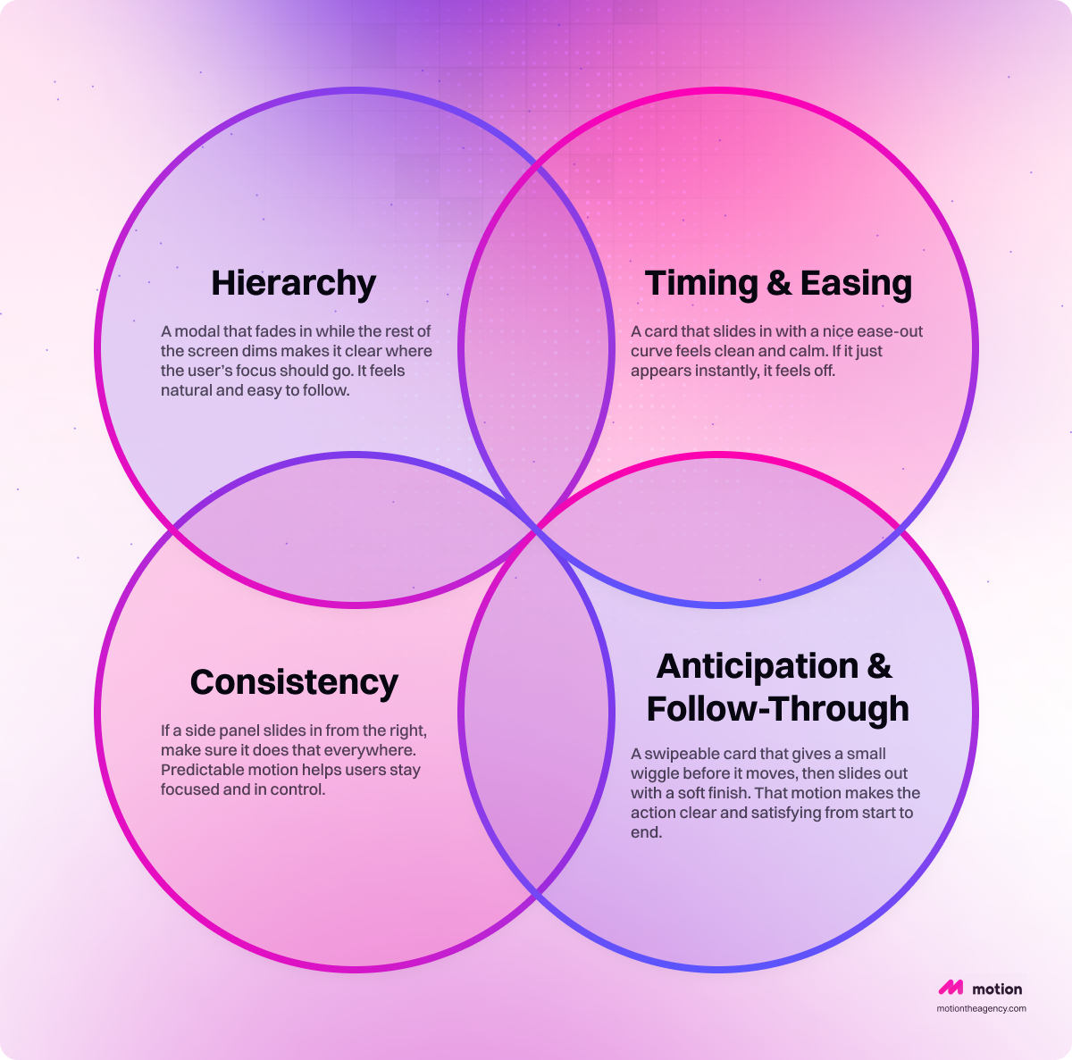
Hierarchy
Motion is great for guiding attention. When used right, it shows people where to look first and what can wait. Without that sense of order, things get confusing fast.
This doesn’t just help with the animation itself. It also makes the web design stronger. When the motion clearly highlights what's important, the layout can support it by placing relevant content around that moment. That could be text, buttons, or visual cues that help tell the full story and keep everything connected.
Example: A modal that fades in while the rest of the screen dims makes it clear where the user’s focus should go. It feels natural and easy to follow.
Timing & Easing
Timing makes or breaks the experience. Too fast and it feels jumpy. Too slow and it drags. Somewhere between 200 and 500 milliseconds usually feels right. Add easing that mimics real movement and you get something that feels smooth and intentional.
This principle is especially important in UI animation, where motion responds directly to how people interact with the product. It’s something designers need to think about early on. That includes the type of content on the page and how fast users might be scrolling. If the animation doesn’t match the pace of the experience, it either gets skipped or ends up feeling off.
We apply this in our own homepage too. The animations are timed to land right when users are most likely to see them. It keeps the flow natural and helps everything feel more connected.
Example: A card that slides in with a nice ease-out curve feels clean and calm. If it just appears instantly, it feels off.
Consistency
Motion is part of your product’s language. If the way things move changes from one screen to another, it can start to feel random and disconnected. Keeping things consistent helps build trust. That means using the same direction, duration, and easing for similar components. When motion follows a pattern, it feels more polished and easier to follow. Users shouldn’t have to relearn how things behave every time they move through your site.
Consistency in UI and web design also plays a big role in branding. When your motion style, layout, and interaction patterns stay consistent, it becomes easier for people to associate that experience with your brand. It’s one of the things that helps a product stand out in a crowded market and feel more memorable.
Example: If a side panel slides in from the right, make sure it does that everywhere. Predictable motion helps users stay focused and in control.
Anticipation & Follow-Through
This one’s all about making animations feel smooth and natural. Anticipation is like a little heads-up before something happens. Follow-through gives the motion a clean finish so it feels complete. Together, they make the interaction feel more human and less mechanical. It’s a simple way to guide the user without saying anything.
But it’s not just about how things move. You also want to think about what content shows up around the animation. What comes right before it? What follows after? Adding related content near the animated element makes everything feel more connected. It helps the user understand what’s going on and makes the whole experience feel intentional, not random.
Example: A swipeable card that gives a small wiggle before it moves, then slides out with a soft finish. That motion makes the action clear and satisfying from start to end.
UI Principles in Action: Apple
We actually talked about this in more detail in our first look at Apple’s Liquid Glass blog. In that article, we pointed out how Apple has been leading the way in UI and UX for years. Whatever design direction they take usually ends up becoming the next big trend. Their micro UI animations and subtle interactions often set the standard for what great motion design looks like. A lot of animation-driven interfaces today are inspired by the way Apple does it.
So in this section, we’re taking a closer look at the principles they seem to value most and how they bring those ideas to life in their products.
Motion Enhances Understanding
Apple doesn’t just add motion to make things pretty. Every animation has a reason — usually to show cause and effect. When you tap something and the screen shifts, that motion tells your brain something just changed and why. It's not just a visual change, it's a narrative moment.
How they apply it:
Opening a new screen slides the content in from the right. Closing it slides back to the left. That directional motion reinforces the idea of moving forward or going back in a flow.
Direct Manipulation
This principle is all about keeping things feeling responsive and alive. Apple wants users to feel like they’re literally moving things with their fingers. So when you touch or drag something, it should react in real time. No lag. No weird delay.
How they apply it:
Scroll something and it moves with your touch. Swipe a card and it follows your finger with zero delay. This makes the interaction feel physical and grounded.
Things Stay Visually Connected
Apple's all about smooth transitions. When you go from one screen to another, or open something new, it often transforms from what was already there. That way, the motion connects the dots and helps you follow along.
What that looks like:
Tap on a photo and it smoothly expands to full screen instead of just cutting to a new layout. It feels like you're staying in the same space.
Keep It Chill, Not Flashy
Apple always leans toward subtlety. Their motion is clean, calm, and super intentional. Nothing jumps out just to get attention. It all supports the experience and lets the content speak for itself.
What that looks like:
Even fun touches like springy icons or soft bounces are super refined. You won’t see anything wild or over-the-top, just smooth motion that makes the whole thing feel premium.
Common Mistakes to Avoid in UI Animation and Web Design
It’s easy to get carried away with animation. We’ve all done it. You add a bounce here, a fade there, maybe a slide-in just for fun. And before you know it, everything on the page is moving. The problem is, too much motion can get in the way. Instead of helping people focus, it starts to distract them. The goal isn’t to animate everything, it’s to animate the right things at the right time.
Another thing to keep an eye on is inconsistent easing. Like when one element glides in smoothly and another one just snaps into place. It might seem like a small detail, but it throws off the whole vibe. Keeping your timing and easing consistent across the design makes everything feel more polished and connected. When things move in sync, the whole interface feels easier to trust.
And then there’s the hidden state issue. If something fades out or slides away without a clear explanation, users are left wondering what just happened. Animation should help tell the story, not confuse people. Always make sure that the motion gives enough context for what changed and why. A little clarity goes a long way.
Conclusion
UI animation and web design naturally go hand in hand. That’s why we always try to make sure they work together seamlessly in our projects. We pay attention to the basic principles not because they’re strict rules that everyone has to follow, but because they help. They bring clarity to the process and make the final experience smoother for both the team and the user.
UI animation and web design principles are the foundational guidelines that shape how a digital experience should look, move, and feel. They help designers and developers build websites and interfaces that are not only beautiful but also functional, responsive, and easy to use. These principles cover everything from layout and spacing to timing, easing, and motion.
That doesn’t mean every design has to follow them perfectly. It really depends on what the page needs. Some projects might break clarity on purpose to grab attention. Others might skip strict hierarchy because the goal isn’t about delivering information. It’s all about understanding the purpose and using the right approach for the moment. We talked about how UI animation affecting UX in our blog "How to Make UI Animation Run Smooth"
If you're thinking about leveling up your website or want to see how we mix motion and design in a way that actually works, hit us up for a quick call or check out our web design services. We’ll walk you through what’s possible and help bring your vision to life.

Syarafina Kuswahyuni
Syarafina Kuswahyuni is a content marketer at Motion The Agency, where she covers explainer video production, motion design trends, and video marketing strategy for SaaS brands. She has worked alongside Motion's animation team on projects for clients including ClickUp, Apollo.io, and HackerRank

In just a few questions, get a tailored estimate for your next video project.

Contact Us
Ready to elevate your brand? Contact us for your
Free Custom Video Sample