The Best UI Animation Examples for SaaS, Fintech, and E-commerce

table of content
TL;DR
UI animation helps digital products feel clearer, smoother, and easier to use. It’s not just there to make things look nice, it guides users, gives feedback, and makes every interaction feel more natural.
- Useful for micro-interactions, transitions, loading states, onboarding, and small delight moments.
- Especially valuable for SaaS dashboards, fintech apps, and e-commerce flows where clarity and trust matter.
- The best UI animation supports the user journey without getting in the way.
UI Animation Example
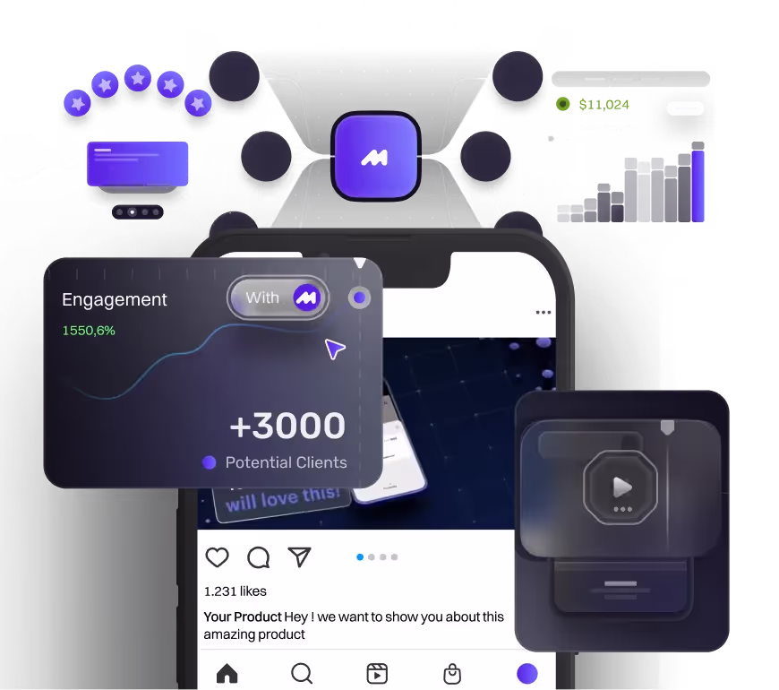
If you landed here from our homepage, you probably noticed a few little animations already. Maybe a button slid in, a headline faded up, or something shifted while you scrolled. Nothing wild, just subtle stuff that makes the page feel more alive. You’ve probably seen the same kind of thing in apps too. Like when a button gives a tiny bounce after you tap it, or a loader spins while something’s happening in the background. That’s UI animation.
It’s the kind of thing you don’t always notice, but you definitely feel. These little movements help guide your eyes, give you feedback, and make the whole thing feel smoother and easier to use. They’re not there to show off. They’re there to help you understand what’s going on, without having to think too hard.
Since we do both motion design and web design, we care a lot about this kind of stuff. We’ve worked on a bunch of products where the animation wasn’t just a nice bonus, it actually made things clearer and more enjoyable to use. A good animation can make a big difference in how confident someone feels while clicking around your app or site.
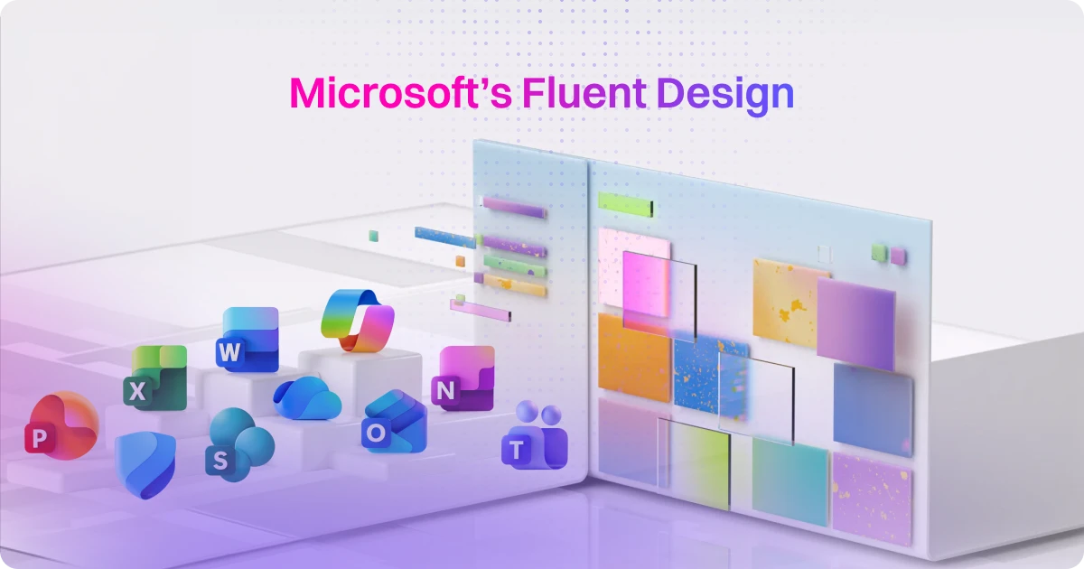
At Motion, UI animation is one of the things we do most for SaaS brands it shows up in everything from homepage hero sections to onboarding flows and product demos. If you're looking for the full picture of how we build video and animation for SaaS companies, our SaaS video production overview is a good starting point before you dive into the examples below.
And that’s what this article’s all about. We’re breaking down what UI animation actually is, why it matters, the types you’ll run into, and how to use it in a way that feels helpful, not distracting. Let’s get into it.
Why, Is UI Animation Important
Okay, imagine you’re looking for something important on a website. You land on the page, but you’re not sure if you’re in the right place. You click a button, but nothing happens right away, is it loading or did it just not work? And even when the info you need is right there, it's buried in a messy layout that's hard to read. That’s exactly where good UI animation steps in. It adds clarity, guides your actions, and helps you feel more confident navigating a digital product.
UI animation makes things feel clearer, more usable, and honestly, more enjoyable. It lets people know what’s interactive, what’s happening behind the scenes, and where they should focus next. Something as simple as a button pulsing when you hover, or a smooth transition when a page loads, can really change how users feel. It’s those small cues that make a product feel alive instead of flat and confusing.
And the best part? These tiny details can turn boring tasks into moments that actually feel good. A progress bar that fills up cleanly makes waiting feel less annoying. A subtle checkmark popping in after you save something gives that quick “yup, you did it” moment. Little touches like that may seem small, but they help people move through your product with more confidence, less guesswork, and a much better vibe overall.
Types of UI Animation in UI Design
Micro-Interaction
What are they?
These are the tiny animations you see when you do something simple on a website or app. Like tapping a button, flipping a toggle, or hovering over an icon. They happen fast but add a lot to the experience.
Real-world examples
Think of a heart icon that fills up when you like a post. A switch that slides from off to on. A button that shrinks slightly when you tap it, then pops back to let you know it worked. Even a small checkmark showing your input was correct, that counts too.
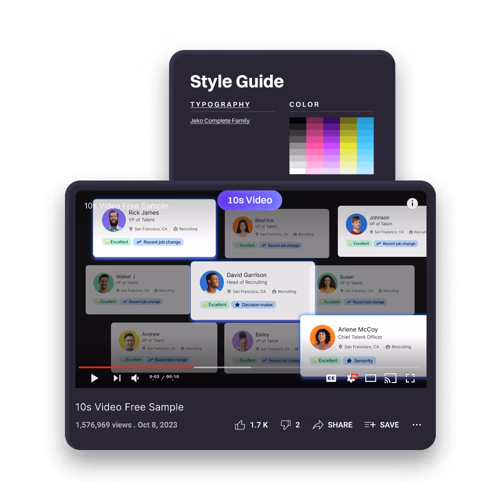
And if we’re talking micro-interactions, Apple is one of the best-known examples out there. They’ve been leading the way for years. The video above shows how their UI animations have evolved over time, making every little action feel smooth, natural, and super intentional.
We dive deeper into this in our blog Apple Liquid Glass Design: A UI Design Revolution or Just Eye Candy?. If you're curious how Apple’s UI animations turned into a full-blown design language, it's worth checking out.
Why they matter?
These little moments give instant feedback. They help you understand what just happened without needing extra explanation. Without them, things feel unresponsive. With them, your product feels more helpful and alive.
The vibe they create
Micro-interactions make things feel smoother, more natural, and more satisfying. Most users won’t consciously think about them, but they’ll feel the difference every time they interact with your product.
Transitional Flows
What are they?
These are the animations that help users move from one part of your site or app to another. Instead of things just popping in and out, transitional flows make everything feel smoother and more connected.
Real-world examples
You’ve probably seen this kind of animation without even thinking about it. Like when a page slides in after you tap a link, or a menu gently fades open instead of just popping up. Or when you tap on a product card and it zooms into full view. That smooth movement helps you follow what’s happening. It shows how one screen leads to the next so nothing ever feels too sudden or confusing.
A solid real-life example? Instagram Stories. When you tap someone’s profile pic, the screen kinda zooms into the story like you’re diving into it. And when you swipe down to close it, it smoothly shrinks back to where you came from. That little animation keeps you oriented. You don’t have to think too hard, it just feels right.
Why they matter?
Without them, everything feels a bit jumpy and disjointed. Transitional animations help people understand where they are, what just happened, and what’s coming next. They make the flow of your product easier to follow.
The vibe they create
These animations bring calm and clarity to the experience. They guide users without being pushy, and make your product feel more thoughtful and well-designed. It’s like giving your interface a sense of rhythm, and users totally feel it.
Feedback & Status Indicators
What are they?
These are the animations and visual cues that let users know something is happening. They show the system is working, thinking, or responding to an action. Without them, people are left wondering if they clicked the right thing or if the app is stuck.
Real-world examples
You’ve definitely seen these before. A little spinner while something loads. A progress bar filling up during a file upload. A green checkmark after submitting a form. Or maybe that red shake when you mess up a login. These animations aren’t just for looks. They’re small signals that let you know something’s happening behind the scenes. They keep things from feeling broken or confusing, especially when there’s a short wait.
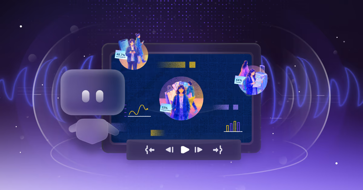
They’re kind of like micro-interactions, but more focused on giving feedback. It’s the system’s way of saying it got your input and is working on it. And when it comes to doing this well, Apple is one of the best. You can see it in the video above. From the Apple Pay approval animation to the subtle cue when Face ID kicks in, everything feels smooth and intentional. Those tiny moments make users feel confident and in control.
Why they matter?
People don’t like being left in the dark. These animations provide reassurance that the system is doing what it’s supposed to. They reduce uncertainty, manage expectations, and help users stay in control, even if they have to wait a few seconds.
The vibe they create
Feedback animations make your product feel responsive, reliable, and human. They build trust by showing the system is listening and reacting in real time. It’s a small thing that makes the whole experience feel way more polished and stress-free.
Onboarding Animations
.png)
What are they?
These are animations that help walk new users through your app or product. Instead of dumping all the info at once, onboarding animations introduce features step by step in a way that feels easy and welcoming.
Real-world examples
You’ve probably seen this in action. Like a little tooltip popping up to show you where to click. Or a quick glow around something you’re supposed to swipe. Maybe even a fun animation or confetti moment when you finish setting something up. These kinds of animations make things feel way easier, especially for first-time users who just need a little nudge in the right direction.
Why they matter?
The first impression really counts. If your app feels confusing from the start, people might bounce. Onboarding animations make learning feel effortless. They reduce overwhelm, highlight key features, and help users actually stick around.
The vibe they create
A smooth, animated onboarding makes your product feel friendly, supportive, and well thought out. It’s like having a guide that shows users around instead of just dropping them into the deep end. And when done right, it leaves a lasting good impression.
Delight Elements
What are they?
These are the fun, unexpected touches that go beyond basic functionality. They’re not about completing a task more efficiently, they’re about making the experience more enjoyable and adding personality to your product.
Real-world examples
A little burst of confetti after you finish a task. A fun animation when you tap on something unexpected. A surprise moment that pops up when you discover a hidden feature. These aren’t must-haves for the product to work, but they make it feel more fun, more human, and honestly just more enjoyable to use.
You’ll see this kind of stuff a lot in apps that use gamification. It’s all about keeping the experience light and encouraging people to come back. Duolingo is a great example. After every lesson, you get a quick celebration animation. Sometimes it’s confetti, sometimes it’s your little Duo character cheering you on. At the same time, it shows your progress and streak so far. It’s simple, but it makes the app feel rewarding and playful in the best way.
Why they matter
Delight elements help users feel good about interacting with your product. They spark emotion, boost engagement, and make people more likely to remember and return to the experience. A little fun can go a long way.
A lot of what makes these examples work translates directly to tech companies outside e commerce too dev tools, SaaS infrastructure, B2B platforms. If your product lives in that space, our tech video production work covers how we approach UI animation for more complex, technical products.
The vibe they create
When used thoughtfully, these details add charm without being distracting. They make your product feel more human and more alive. It shows you care about the experience, not just the outcome.
Industry-Specific UI Animation Spotlight
So, in the previous section, we talked about different types of website animation you’ll often see online. But it’s worth noting that not every industry uses UI animation the same way. What works for an e-commerce brand might not make sense for a fintech app or a B2B dashboard.
Now here’s a quick heads-up before we dive into the next part. As an agency, we mostly work with companies in the IT, SaaS, and tech space. So everything we’re sharing below comes from our hands-on experience with those kinds of clients, along with research our team specifically did while putting this content together.
SaaS Dashboards
.png)
Why it matters and what it looks like
Dashboards can get messy real quick. There’s a lot of data, filters, charts, and buttons flying around, and if nothing moves or guides you, it’s easy to feel lost. That’s where animation steps in. A smooth chart transition, a tooltip that fades in, or a panel that slides open can make a huge difference. It helps you understand what’s going on without thinking too hard.
Real-world example
Say you’re switching between time ranges in a sales dashboard. Instead of all the charts jumping around, they update smoothly and draw your eyes to the change. Or when you click on a team member, their info glides in from the side instead of loading on a new page. It feels clear, quick, and just more human.
Fintech Apps
Why it matters and what it looks like
In finance, trust is everything. Users want to know their actions went through, especially when money’s involved. That’s why animation plays a big role here. A quick confirmation checkmark, a smooth balance update, or a subtle transition between steps in a payment flow helps build confidence and keeps users calm.
Real-world example
Imagine transferring money and seeing a clean little animation that confirms it was successful. Or watching your balance update with a smooth count-up instead of just switching numbers. These details might seem small, but they go a long way in making users feel like everything’s working properly.
E-commerce Checkout Flows
Why it matters and what it looks like
Checkout can be a stressful moment. People are entering payment info, wondering if it’ll go through, or second-guessing their purchase. That’s where animation helps a lot. A quick cart slide-in, a smooth progress bar, or a friendly little confirmation screen can guide users and make the whole process feel easier and more trustworthy.
Real-world example
Picture this, you add something to your cart and it slides in with a little bounce. Nice and clear. Then during checkout, you see a progress bar showing you're halfway there. After payment, a checkmark appears or maybe even a fun little confetti burst. It’s simple stuff, but it helps users feel like they’re in good hands from start to finish.
What Does it Mean For the Product Team
Wait, why are we suddenly talking to product teams in a blog about UI animation?
Simple. The whole point of UI animation is to make the experience feel smooth, intuitive, and engaging. It’s what helps users stick around instead of bouncing off the page. And when your product is complex, animation becomes even more important. It can guide users through steps, give them context, and make the whole journey feel less overwhelming. Which means it’s not just a design thing, it’s very much a product thing too.
Here are a few takeaways worth keeping in mind:
- Boost engagement: Animations give feedback, guide users, and add little touches of delight that make the experience more enjoyable.
- Use motion principles: Timing, easing, and anticipation all help animations feel smooth and natural, not distracting or clunky.
- Focus on industry-specific needs: SaaS, fintech, e-commerce, each one has different user expectations. Tailor your animations to what actually helps in that context.
- Test and iterate: Watch how users interact, gather feedback, and keep improving. Animation is never just set it and forget it.
Conclusion
So at the end of the day, UI animation isn’t just about making things look nice. It’s about improving how people experience your product. From small interactions like button taps to full onboarding flows, animation helps guide users, build trust, and make things feel more polished and easier to use.
Whether you’re working on a SaaS dashboard, a fintech platform, or an e-commerce site, thoughtful animation can add clarity and flow in ways static design can’t. And if you’re on a product team, this is a reminder that animation is more than a design detail, it’s a key part of the user experience.
If you're exploring ways to bring more motion into your product, our UI animation services are built to support fast-moving teams like yours. Or if you'd rather talk things through, you can book a quick call with us and we’ll take it from there.
FAQ

Syarafina Kuswahyuni
Syarafina Kuswahyuni is a content marketer at Motion The Agency, where she covers explainer video production, motion design trends, and video marketing strategy for SaaS brands. She has worked alongside Motion's animation team on projects for clients including ClickUp, Apollo.io, and HackerRank

In just a few questions, get a tailored estimate for your next video project.

Contact Us
Ready to elevate your brand? Contact us for your
Free Custom Video Sample