


Apple Liquid Glass Design: A UI Design Revolution or Just Eye Candy

table of content
On June 10th, 2025, during one of our regular morning meetings, our team came across Apple’s latest UI and UX announcement: the debut of their new Liquid Glass design. It instantly caught our attention. As designers, we’re always tuned in to shifts in interface design, but this one felt different. It was bold, immersive, and visually striking enough that we knew we had to dig deeper, do some research, and share our thoughts.
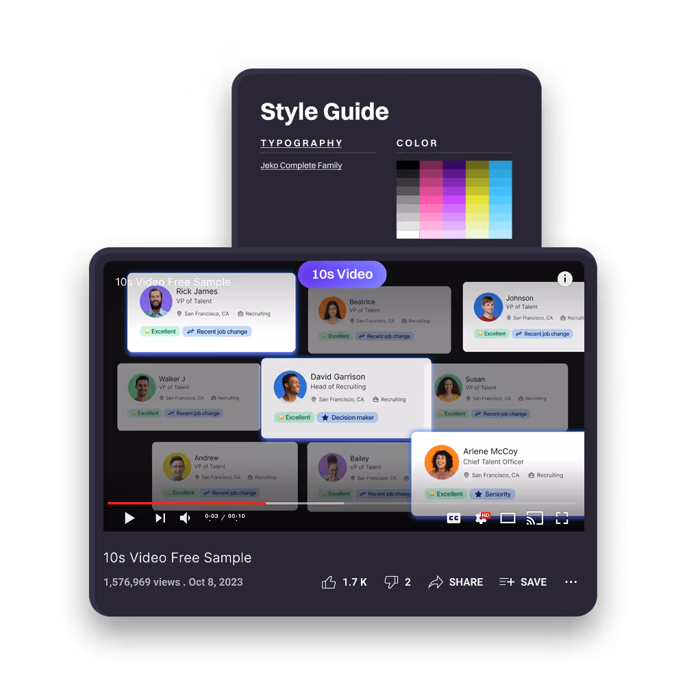
You might be wondering why Motion The Agency, known mostly for motion design, is talking about UI and UX, You can check our UI case study for Open Money and Sharpish, to know more about our UI design services. The answer is simple. We design interfaces too, and we take it seriously. Behind every smooth animation or interactive prototype, there’s thoughtful UI work shaping the experience. Apple’s Liquid Glass announcement gave us the perfect excuse to talk about interface design from our point of view and explore where things might be heading.
Before we jump into our thoughts and opinions, it's worth mentioning that this article was written before the design was released to the public. This isn’t a product review in any shape or form. It’s simply our honest first look, as designers who build digital experiences every day.
So, What is Apple Liquid Glass?
Apple’s new Liquid Glass design was officially announced on June 10th, 2025, during WWDC, and it’s expected to roll out publicly in September alongside iOS 19, iPadOS 19, and macOS Sequoia. From what we’ve seen in the launch video and on their website, this update marks a bold new visual direction for Apple’s interface design. The most noticeable change is translucent, fluid-like surfaces applied to UI elements like widgets, control panels, and background layers. These surfaces shift and respond to light and motion in real time, creating a more animated, almost living interface.
It’s Apple’s latest attempt to make the user experience feel more immersive and responsive, something that blends aesthetics with interactivity. The look is sleek, futuristic, and clearly built to showcase just how far Apple’s rendering capabilities have come. But as visually striking as it is, it also raises questions about everyday usability. For us as UI/UX designers, it immediately made us wonder: How much of this is about function, and how much is just about flexing style?
Apple Has Been Known To Be UI/UX Pioneer
Well with the announcement of the Liquid Glass, we were not going to ignore everything else apple has put out that lead into this. Apple has been known to put out thought provoking design, that most of the times lead into a trend in UI/UX industry.
Apple has been embracing the innovation and growth of UI and UX design, but their principles could still be seen throughout the updates they put out.
The one thing that apple are serious about when it come to their UI/UX design is that they have to follow their strict guidelines, which preach simplicity, clarity, and consistency, which is why their updates tend to be user-centric, like:
Aqua: A ground Breaking Interface (Apple, 2001)
.png)
Alright, let’s rewind to 2001 when Apple introduced something called Aqua with macOS X. If you’ve never seen it, think glossy buttons, soft shadows, and that famous “Genie effect” when you minimized a window. It was slick. Everything felt a bit more alive, a bit more human, and, honestly, way ahead of its time.
What really made Aqua stand out was how it used animation in the interface. Dock icons would bounce when you opened an app and bounce again in a different rhythm when that app needed your attention. It wasn’t just visual fluff. It actually helped guide how you used the system.
Apple had a clear goal. They wanted something powerful for pros but still easy for new users to get into, and they nailed it. Aqua brought personality to the interface without sacrificing clarity or usability. It laid the foundation for how we think about interactive design today.
Iphone & iOS 7: UI/UX Design At the Palm of Your Hand
.png)
When the first iPhone dropped in 2007, Apple didn’t just launch a phone — they completely changed how we think about digital interfaces. Everything was touch-first. Simple icons, gesture-based navigation, and just an overall feel that made using your phone actually fun. It set a new standard for mobile UI.
Fast forward to 2013, and Apple shook things up again with iOS 7. This update marked a major shift away from skeuomorphic textures and into flat, minimal design focused on clarity. At the time, Jony Ive — Apple’s Chief Design Officer — described it as “bringing order to complexity.” And that vision hit hard across the design world.
But it wasn’t just about how it looked. IOS 7 brought in design features that clearly put user comfort at the center. Some of the highlights:
- A full visual refresh: Icons moved from literal to more abstract and simplified shapes. The whole interface felt lighter, with vibrant colors, translucent layers, and subtle parallax effects.
- Typography and depth: Cleaner fonts, layered glass-like panels, and smooth animations gave the UI a dynamic, almost 3D feel.
- Smarter gestures: Swipe up for Control Center, faster multitasking, better lock-screen notifications, and smoother transitions across the board.
- Quick access: Control Center made it super easy to toggle things like Wi-Fi, brightness, flashlight, and airplane mode, no digging through settings.
What made those past Apple design shifts really work was the balance they struck, beauty with function, clarity with purpose. Each update felt intentional, blending visual appeal with everyday usability. But with Liquid Glass, that balance feels a bit off. It definitely looks stunning, but the practical side doesn’t feel as carefully thought through as we’d expect from Apple.
What We Like About Liquid Glass
.png)
Okay before jumping to our concerns, let’s talk about we like first:
There’s no denying it, Liquid Glass looks good. It’s sleek, modern, and polished in a way that immediately feels premium. The way Apple uses translucency, motion, and layered depth gives the interface a smooth, elevated look that feels fresh without being overdesigned.
It also does a great job reinforcing Apple’s visual identity. This design isn’t coming out of nowhere. It builds naturally on Apple’s history with frosted-glass effects, especially in earlier versions of iOS and macOS, and evolves that aesthetic into something more dynamic and animated.
Beyond just looks, Liquid Glass is clearly meant to showcase what Apple hardware can do. The design leans into real-time rendering, smooth transitions, and high frame rates that only shine on powerful devices. It feels like a deliberate move to blur the line between interface and animation, and from that angle, it really delivers.
But, Is The Liquid Glass Design Functional?
From what we’ve seen in developer beta reviews, Apple’s website, and the launch video, we can safely say that Liquid Glass is functional. It works well, runs smoothly, and clearly takes advantage of Apple’s hardware. So what’s the issue?
.png)
The problem is that while it’s functional, it doesn’t fully align with Apple’s usual design standards. Especially when it comes to putting the user first. It’s visually exciting, but it brings up concerns around clarity, comfort, and real-world usability. And for a company that has always stood for clean, intentional, user-centered design, that feels like a step in the wrong direction.
The biggest concern our designer noticed, and something a lot of users online have pointed out as well, is the lack of readability in the new design. Text often sits on top of translucent or animated backgrounds, which makes it harder to read, especially in bright or low-contrast environments. The overall clarity takes a hit, and key elements like buttons or icons can start to blend into the background. This not only affects general usability but also raises real accessibility concerns, particularly for users with visual impairments who rely on strong contrast and clear layouts to navigate with ease.
Another concern we found is that is the lack of any toggle or customization options for Liquid Glass. Right now, there doesn’t seem to be a way to turn it off or tone it down, which raises even more accessibility concerns. As designers, we’re all for good aesthetics, but usability has to come first. And in this case, the design feels more like a visual statement than something built for everyday practicality.
How Liquid Glass Compares to Other “Glass” UIs

Apple isn’t the first to experiment with a glass-inspired interface. Back in the day, Windows Vista’s Aero Glass introduced translucent panels and glowing effects that aimed to feel modern and premium. It looked futuristic for its time, but it came with a cost. The design was resource-heavy and often ended up slowing down the user experience rather than improving it.
A more current comparison would be Android 16’s Material 3 Expressive. Google took a different approach, focusing on accessibility and visual clarity. Material 3 uses flat, clean colors and smooth, predictable animations that feel deliberate and user-first. It may not be as flashy, but it works well across a wide range of users and devices.
.png)
If Apple responds to the current feedback and puts more focus on accessibility and user control, Liquid Glass could absolutely hold its ground against Material 3 Expressive. The visual idea is strong, but it needs to be backed by flexibility. With a few smart updates, it could offer both beauty and everyday usability.
Why This Matters to Us As A Creative Agency
We genuinely admire Apple’s creative ambition with Liquid Glass. It’s a bold direction that pushes visual design into new territory, and it’s always exciting to see how they continue to shape digital experiences. As a team that works across both motion and UI/UX, we’re always curious about how these shifts might influence the way we design. Liquid Glass is visually inspiring, and we’re already exploring how we can draw from some of its more subtle visual cues in our own work.
That said, here at Motion The Agency, one of the things we always prioritize — aside from building strong visual branding — is clarity and readability. It’s our number one rule when designing anything meant to serve users. That’s why we look closely at trends like this. If our clients ever reference them in future projects, we want to make sure we’re guiding them toward design decisions that not only look great but also meet the standards we’re known for.
If you’re looking to elevate your product with clean, intuitive, and beautiful UI design, check out our UI/UX services and feel free to book a call. Let’s build something that’s not just great to look at, but great to use too.

Syarafina Kuswahyuni
Syarafina Kuswahyuni is a content marketer at Motion The Agency, where she covers explainer video production, motion design trends, and video marketing strategy for SaaS brands. She has worked alongside Motion's animation team on projects for clients including ClickUp, Apollo.io, and HackerRank

In just a few questions, get a tailored estimate for your next video project.

Contact Us
Ready to elevate your brand? Contact us for your
Free Custom Video Sample


