Hyperexponential’s Explainer Video Case Study: AI-Assisted, Human-Led Workflow
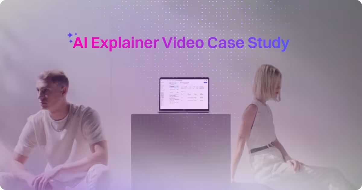
table of content
Key takeaways
- A strong explainer video doesn’t need a finished product. With the right visual system and close collaboration, you can still communicate value clearly and confidently.
- Tight timelines require smart trade-offs. Skipping a traditional storyboard doesn’t mean skipping structure if the script and references are strong.
- AI works best as a creative assistant, not a replacement. Speed comes from automation, but quality comes from human taste and decision-making.
- A flexible workflow matters more than a rigid one. Adapting the process to the project is often what delivers the best result.
Hyperexponential's case study
In this blog, things are going to be a little different from our usual posts. This one’s an explainer video case study for our project with Hyperexponential. Think of it as a behind-the-scenes look at how we pulled the whole thing together.
Alright, let’s start from the beginning. Hyperexponential (HX) came to us in late 2025 asking for a fast-paced, sizzle-reel-style explainer video. The goal was simple: introduce and explain their new partnership with Guidewire. And based on how they described it, this partnership was a pretty big deal in the insurance world.
HX is an AI-powered pricing and underwriting platform for commercial property and casualty (P&C) insurance, so the message had to be clear without feeling cold or overly technical. The video needed to highlight how advanced the system is, while keeping the story human, relatable, and easy to follow, even for viewers who aren’t deep in insurance workflows.
The deliverable was a 90-second explainer video with sizzle-reel energy. It frames the audience pain point, introduces HX’s core value and key capabilities, builds excitement around what the Guidewire partnership enables, and closes with a clear call to action.
And this is how we do it.
Challenges
Video for an unfinished product
No project comes without challenges, and the HX video was no exception. One of the first things Motion The Agency noticed was that HX’s collaboration with Guidewire wouldn’t fully roll out until 2026. That meant there was limited real product footage available during production.
Because of that, some of the UI and product moments had to be handled in two ways. In a few places, Motion The Agency used older design assets HX already had available. In others, Motion The Agency created new UI visuals in the same style and only moved forward once the HX team reviewed and approved them.
This required extra care and close collaboration. There was a fair bit of back and forth to make sure every detail stayed within HX’s standards and felt accurate to the product.
An explainer video that hypes up people
This might not sound like a typical “challenge,” but it was an important balance to manage throughout the process. Explainer videos typically sit in the MOFU stage, where the audience is already interested but wants to understand the product better. At this point, the goal is less about attracting attention and more about educating and clarifying value.
At the same time, this was a brand-new partnership, so it needed energy and momentum too. And because everything had to fit into under two minutes, the message needed to be tight and intentional.
So the approach was simple: clarity first, then energy through the visuals. The key points were delivered in a clean, structured way, while the pacing, footage, and animation brought the hype. The goal was to make it feel premium and exciting, without anything looking out of place or disconnected from the product.
Tight timeline and creative trade-offs
The timeline for this project was tight. From the initial call to final delivery, the entire explainer video needed to be completed in under three weeks, including review and revision rounds.
Because of that constraint, Motion The Agency had to make a deliberate creative decision early on. Normally, storyboards play a major role in explainer videos. As covered in ”Motion The Agency’s storyboard for explainer video” blog, a strong storyboard often acts as the foundation that aligns structure, pacing, and messaging before animation begins.
In this case, the compressed schedule meant a traditional storyboard workflow would have slowed everything down. Instead, Motion The Agency used a tightly written script and clear visual references as the guiding framework. This kept momentum high, allowed flexibility during revisions, and still delivered a polished explainer without compromising clarity or quality.
No live action shots
Another challenge during the HX production was adding the “human element.” Motion The Agency doesn’t do live-action shoots, but the video still needed to feel grounded and relatable, not just focused on product UI and abstract visuals.
For this project, due to the tight timeline, Motion The Agency relied primarily on AI-generated footage to represent key human moments. This made it possible to move quickly, control the look and pacing of each scene, and stay flexible during revisions, while still keeping the visuals consistent with HX’s brand.
AI as a creative assistant
Okay, let’s talk about the actual explainer video process. As mentioned earlier, time was limited on this project. While Motion The Agency prides itself on moving fast without sacrificing quality, creating something truly creative still takes time.
In this case, it was a challenge the team had to take seriously. Motion The Agency had less than three weeks, including revisions, to produce an almost three-minute mixed-media explainer video, and the project didn’t start with a finalised script. Managing scope, creativity, and quality within that timeframe required a focused and flexible production approach.
AI helped speed up parts of the workflow, but it wasn’t driving the creative. Motion The Agency still worked with human creatives throughout the process. Think of AI as an assistant. The thinking, taste, and creative decisions behind the video still came from the designers.
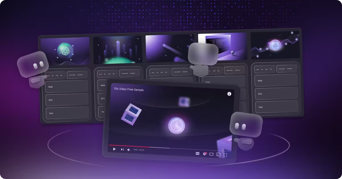
.png)
The first decision we aligned on with the client was to move forward without a storyboard. To make sure we stayed on the same page and clearly understood each other’s expectations, we wrote the script with video and image references. This helped lock in the creative direction early, even without a traditional storyboard, as shown in the snippets above.
AI was already part of the workflow at this stage too. We write our own scripts for almost every project, but we use AI as a support tool for grammar and spelling checks, so the writing stays clean and consistent before moving into production.
From those references, AI was then used to quickly generate the foundational visuals:
- Initial characters and environments were created using Midjourney.
- Because the video required multiple shots in the same setting, we used Google Nano Banana to create consistent variations of the same character and environment.
- Once the still images were finalised, we generated motion sequences using Kling AI.
This approach let us move fast while keeping the visuals consistent across the full video.
Human-led creative
Once the AI shots were generated, it was important to treat them as a starting point, not the finished product. The outputs served as the base layer, giving us speed and direction, but they still needed real craft to reach a professional standard.
From there, every shot was edited and refined through professional post-production and animation. AI visuals were treated as raw material, then carefully manipulated, polished, and shaped to meet Motion The Agency’s quality standards.
Key techniques used
To deliver a professional-level video, we need to package it in a way that doesn’t feel like we simply generated something with AI and stopped there. As mentioned in our “Top 8 Generative AI Video Tools for 2026” blog, no matter how good AI-generated video becomes, it will always have imperfections that can make it feel out of place or uncanny. In this section, we explain how we turn those imperfections into something intentional and polished.
Smooth transitions
.gif)
Smooth transitions play a big role in keeping the explainer easy to follow. Instead of abrupt or linear motion, movements ease in and out naturally, which helps the animation feel intentional rather than mechanical. This kind of easing creates a smoother rhythm and makes scene changes feel less jarring.
Visual continuity is just as important. Elements are designed to relate to each other across shots through consistent scale, alignment, and motion direction. This helps guide the viewer’s eye and creates a sense of flow rather than a series of disconnected scenes.
Each moment is also designed around a single focal action. By limiting how many elements move at once, the animation stays readable and avoids visual noise that could distract from the message.
Layered composition
.gif)
Layering is used to create depth and spatial awareness within each scene. Foreground, midground, and background elements work together to add dimensionality, while subtle parallax movement helps the visuals feel more immersive and grounded.
Lighting and texture are handled as separate layers rather than baked into a single image. Shadows, highlights, grain, blur, and light leaks are introduced individually, allowing for more control and creating small imperfections that make the visuals feel more natural.
This layered approach also supports clear visual hierarchy. Important elements stay forward and prominent, while supporting elements sit further back, guiding attention without overwhelming the viewer.
Transform consistency
.gif)
When elements move or transform, their core properties stay consistent. Scale, proportions, and visual identity are preserved throughout the animation so nothing feels like it suddenly “changes character” mid-motion.
Maintaining this consistency is especially important in explainer videos, where clarity matters more than flashy effects. Even when transitions are dynamic, the viewer should always recognise what they’re looking at and how it relates to the previous scene.
Film-like imperfections
To avoid a sterile or overly digital look, subtle film-inspired imperfections are added during post-production. Lens distortion gently warps the edges of the frame, mimicking how real camera lenses bend light, particularly in wider shots.
Noise, or grain, is applied lightly across scenes to introduce texture. Real footage always contains some level of grain due to sensors and lighting conditions, and adding it back helps the animation feel more organic and cinematic rather than perfectly clean.
Conclusion
At the end of the day, our goal is to deliver your dream design, whether that’s a video or something else entirely. That means making sure everything we produce meets both our standards and yours.
We have a solid workflow, but we’re not rigid. Depending on the project, we’ll adjust the process to fit what you need so you get the best result possible. If you have an explainer video in mind, feel free to visit our explainer video service page and request a free sample.
FAQ

Syarafina Kuswahyuni
Syarafina Kuswahyuni is a content marketer at Motion The Agency, where she covers explainer video production, motion design trends, and video marketing strategy for SaaS brands. She has worked alongside Motion's animation team on projects for clients including ClickUp, Apollo.io, and HackerRank


Pujita Tandiono
As our Head of Animation, Pujita is a powerhouse of creativity, specializing in both 2D and 3D animation while also possessing strong design capabilities. His deep understanding of current industry trends and emerging motion graphics allows him to consistently deliver innovative and engaging animated content that pushes creative boundaries and captivates audiences.
In just a few questions, get a tailored estimate for your next video project.

.png)
Contact Us
Ready to elevate your brand? Contact us for your
Free Custom Video Sample